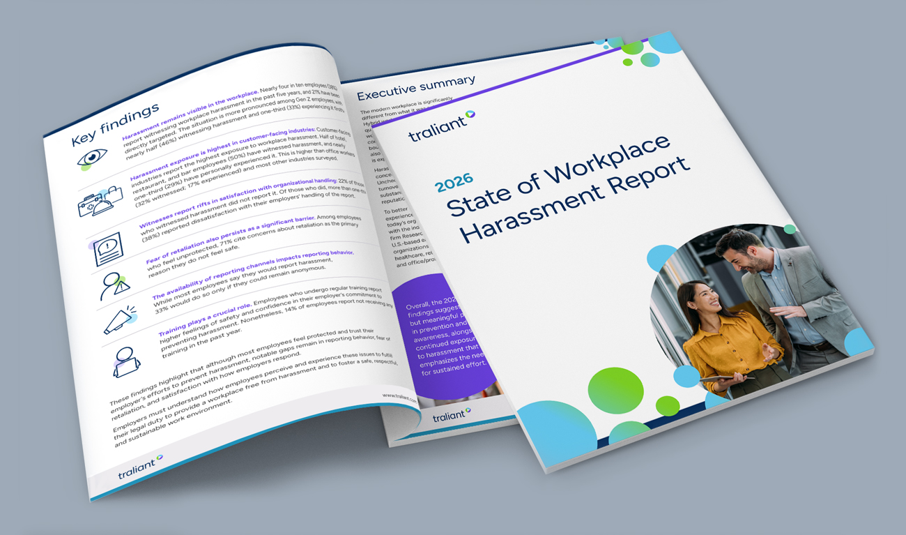
Traliant Brand Evolution
Full visual rebrand
Following a merger of three companies, Traliant, a provider in compliance training, needed a unified brand that maintained a foundation of trust and reliability.
To be distinct in a sea of compliance competitors, the brand needed to be modern and approachable while balancing human connection and professional authority.
To position Traliant as the partner customers can count on for all their compliance needs.
Traliant
Figma, Illustrator, Photoshop
Behind the Design
In approaching this brand evolution, I wanted to highlight the strengths of the three original companies: high‑quality training, trustworthy expertise and human-centered service. The new brand needed to balance these three tenets in a modern, approachable way while standing out among Traliant's competitors.
This was a full evolution: a new logo, color palette, typography and graphic elements. I began by looking closely at Traliant's customers, delving into user metrics, listening to interviews and direct feedback and reviewing previous analytics from our past brand iterations to identify what resonated most.
The most common theme I found in this research was the desire for a true compliance partner — one that balanced assistance with rigid legal requirements and engaging training content that employees actually remember and apply when it matters most.
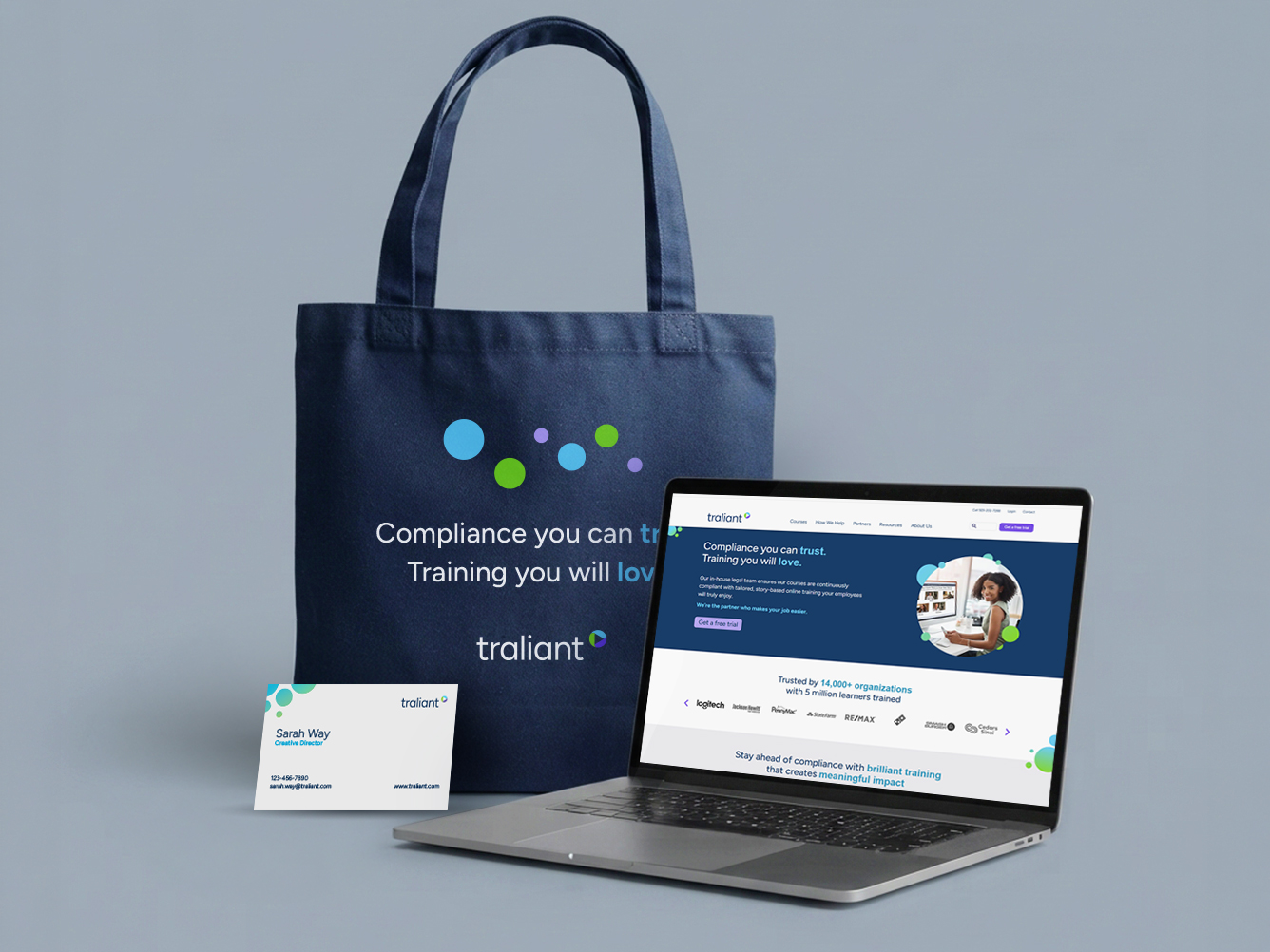
Most competitors had muted color palettes, forgettable typography and generic graphic elements. Traliant wanted something different — bright, fresh colors, friendly, yet professional fonts and colorful graphic elements that reinforced the brand promise: Compliance you can trust. Training you will love.
Core Elements
Rooted in human-centered design, the visual system balances trust with a modern, approachable aesthetic. Every element, from color palette to typography, was intentionally designed to convey professionalism, trustworthiness and a forward-thinking approach to compliance.
Logo
The logo system honors the heritage of the three founding companies through an interconnected three-part emblem, symbolizing the interdependence of compliance, training and partnership.
Built within a circular framework representing constancy and connection, the mark also subtly nods to video content, which is at the center of Traliant's training. Paired with a modern, geometric font in lowercase lettering, the wordmark balances friendliness with professional authority.

Color Palette
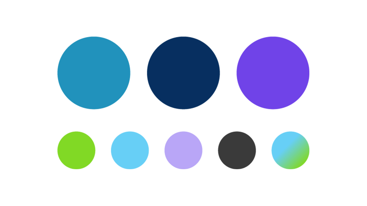
The vibrant color palette balances Traliant's history of trust with its future in innovation. The blend of professional, rich tones and energetic, fresh accents created a flexible color system that resonates across a diverse audience.
When developing the color palette, accessibility was always top of mind. The brand guidelines outlined strict usage requirements that aligned with WCAG 2.2 Level AA compliance, ensuring that the brand remains inclusive and accessible for all customers.
The primary color palette is warm and inviting, consisting of teal, navy and purple which act as a foundation for dependability, trust and creativity.
The secondary colors consist of lime green, cyan, and light purple, bringing energy, growth and contrast.
Together, these colors unify the brand in a modern and friendly aesthetic that distinguishes Traliant in a competitive landscape.
Typography
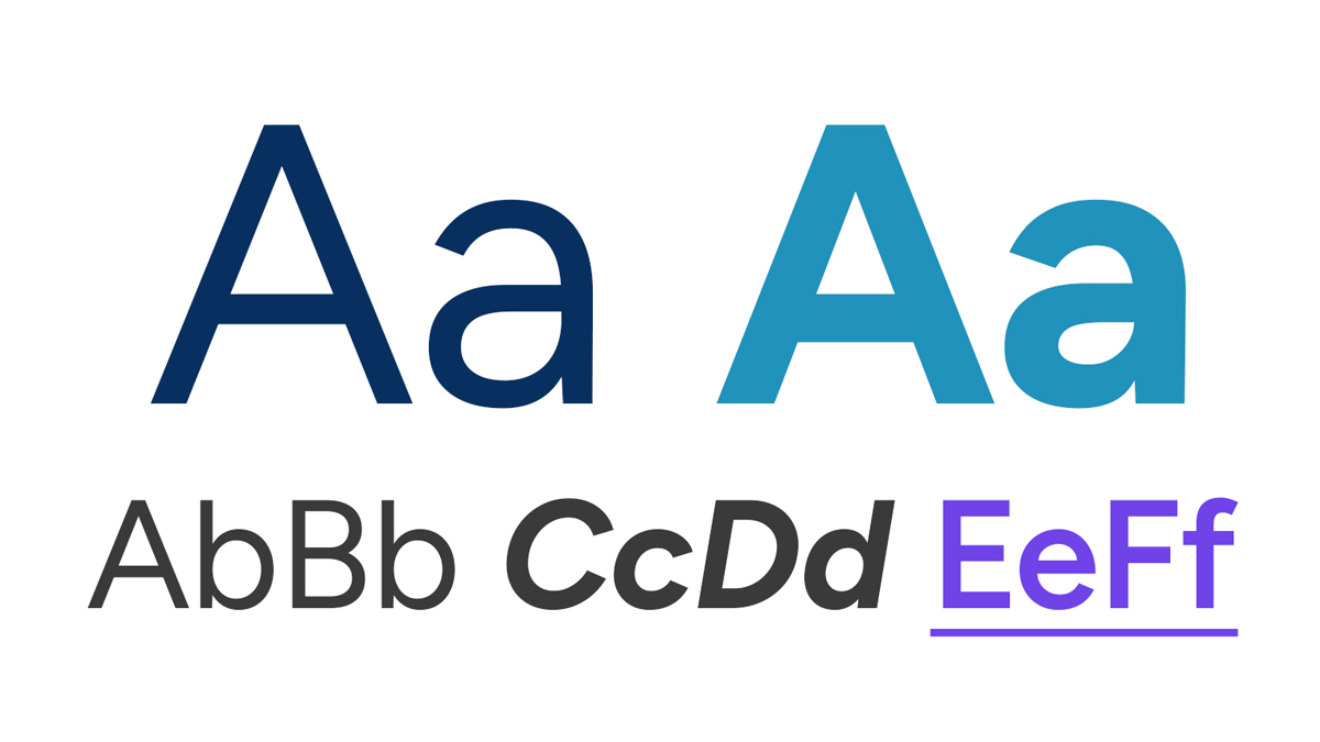
To complement the brand's human-centered direction, I wanted a modern geometric typeface that balanced trust, professionalism and warmth.
Rooted in a clean, geometric structure, Figtree's open letterforms and balanced proportions ensure high legibility while projecting the confidence and clarity essential for modern compliance training.
The Results
The impact of the rebrand was immediate, bridging aesthetic modernization with measurable business growth within the first 90 days.
Increase in website engagement
Increase in conversions
Increase in creative efficiency
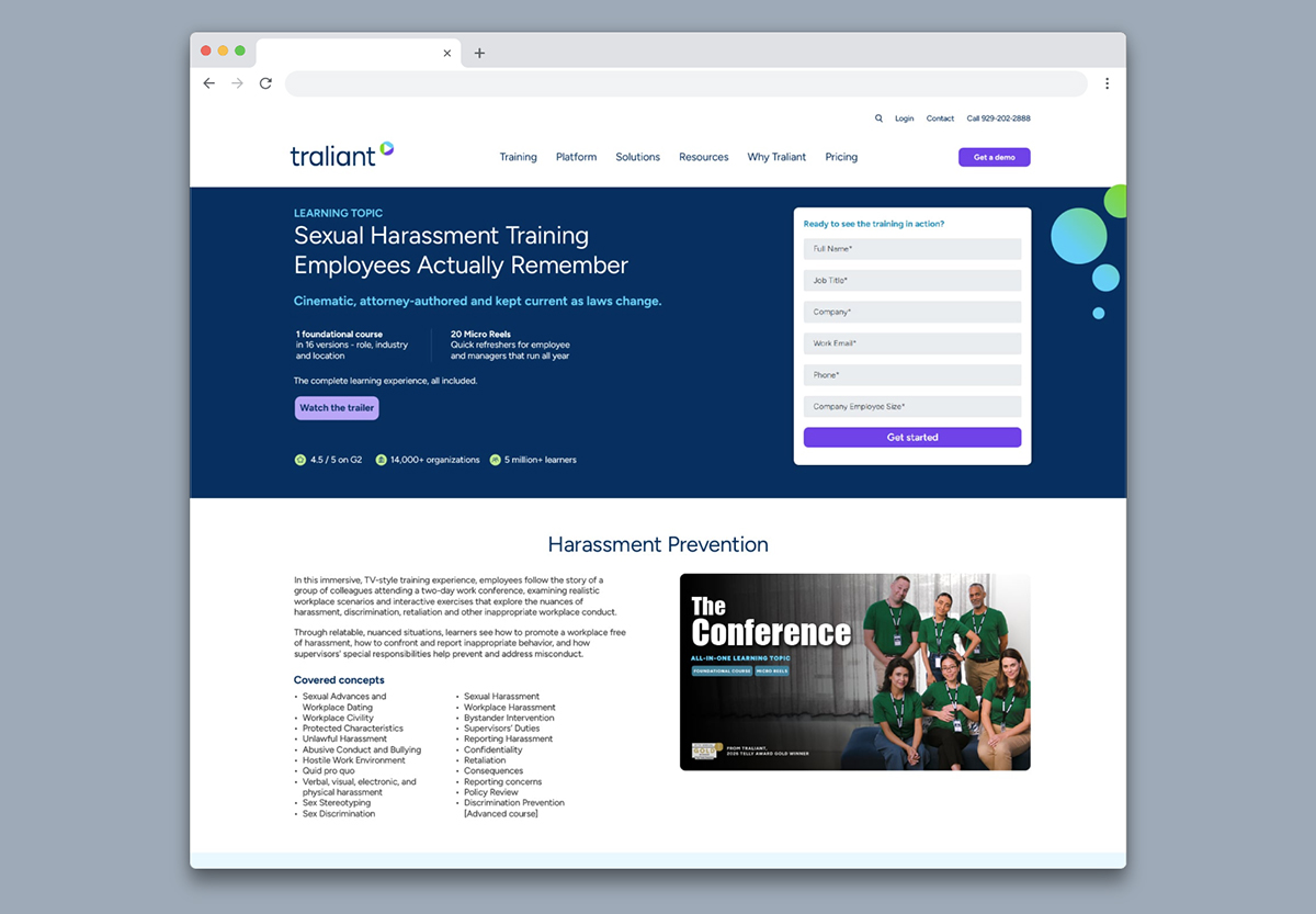
The Website
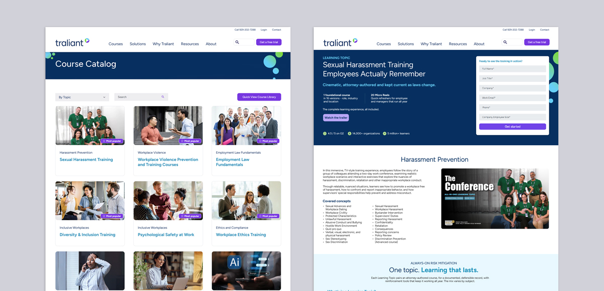
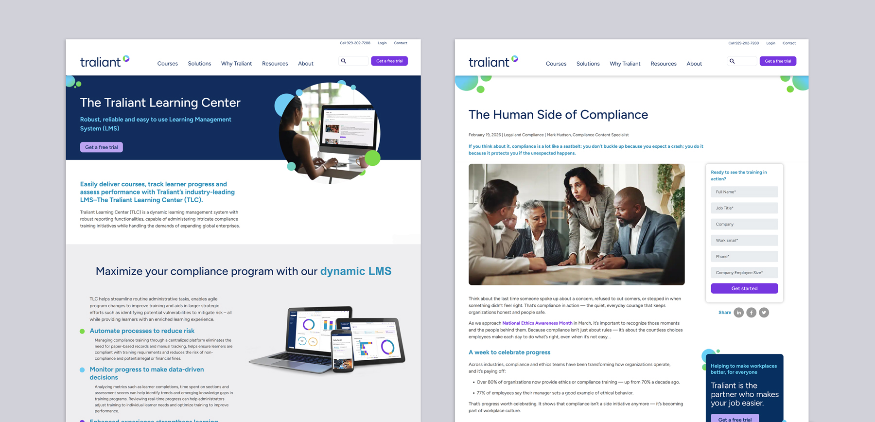
As the primary digital anchor for the brand, the website was redesigned to prioritize user clarity and modern SaaS aesthetics, while standing out from competitors. I ensured the interface balanced high‑density information with an approachable, human‑centered user interface that reflects Traliant’s mission.

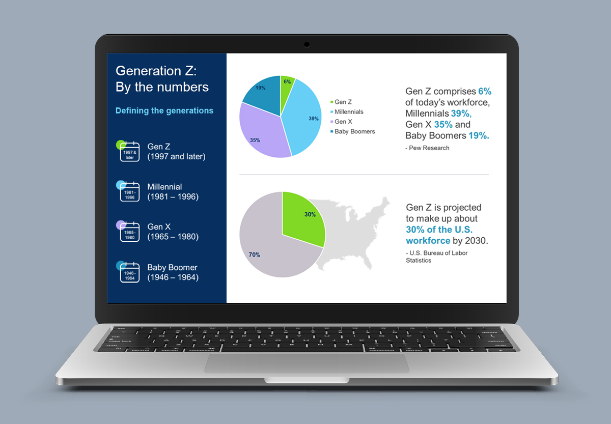
Presentation Design
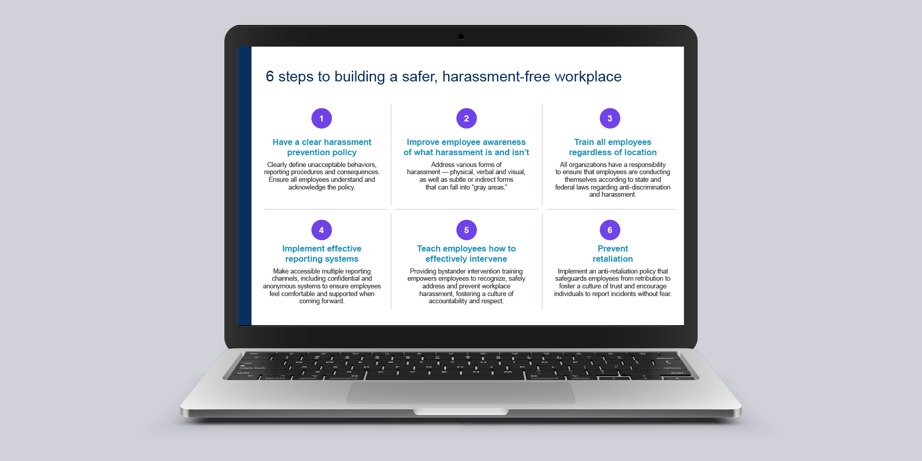
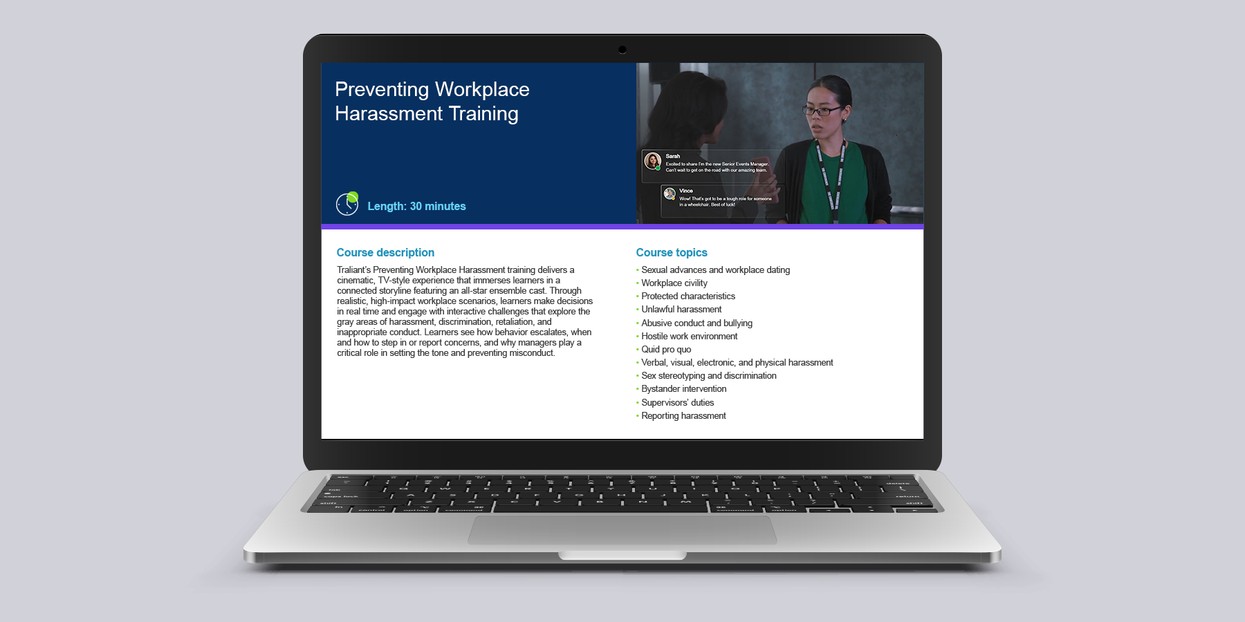
To ensure the new identity resonated across every touchpoint, I developed a comprehensive system for internal and external communications. By creating high‑utility PowerPoint templates, I empowered the team to produce authoritative content that remains visually aligned with the core brand, regardless of the platform.

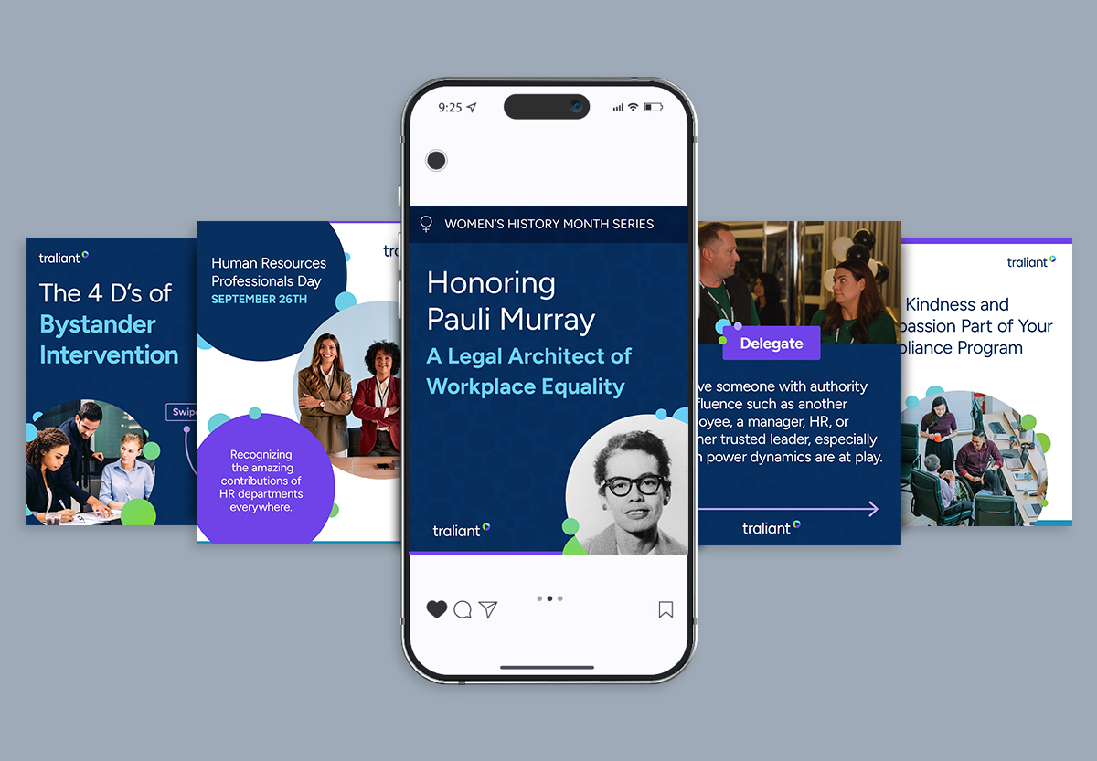
Social Media Content
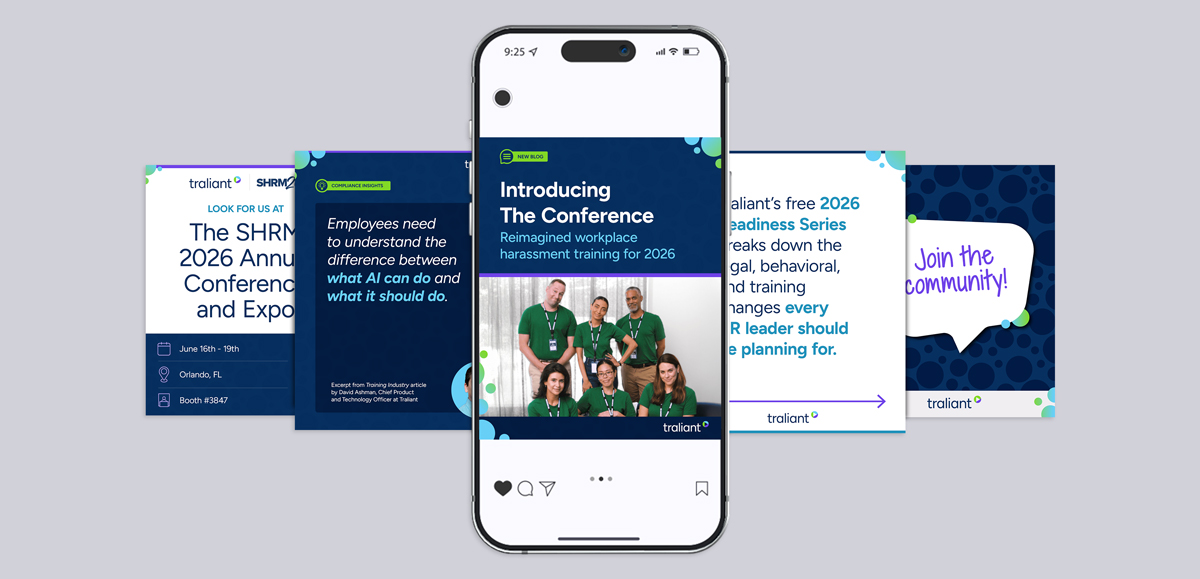
To maintain brand consistency across external channels, I developed a flexible, modular social media template system. Built within the refreshed visual framework, these templates balance dynamic typographic layouts with the brand's vibrant color palette and custom graphic elements. The modular structure allows the marketing team to quickly produce on-brand, high-impact content for diverse campaigns while ensuring instant recognition and a cohesive visual presence across every social touchpoint.
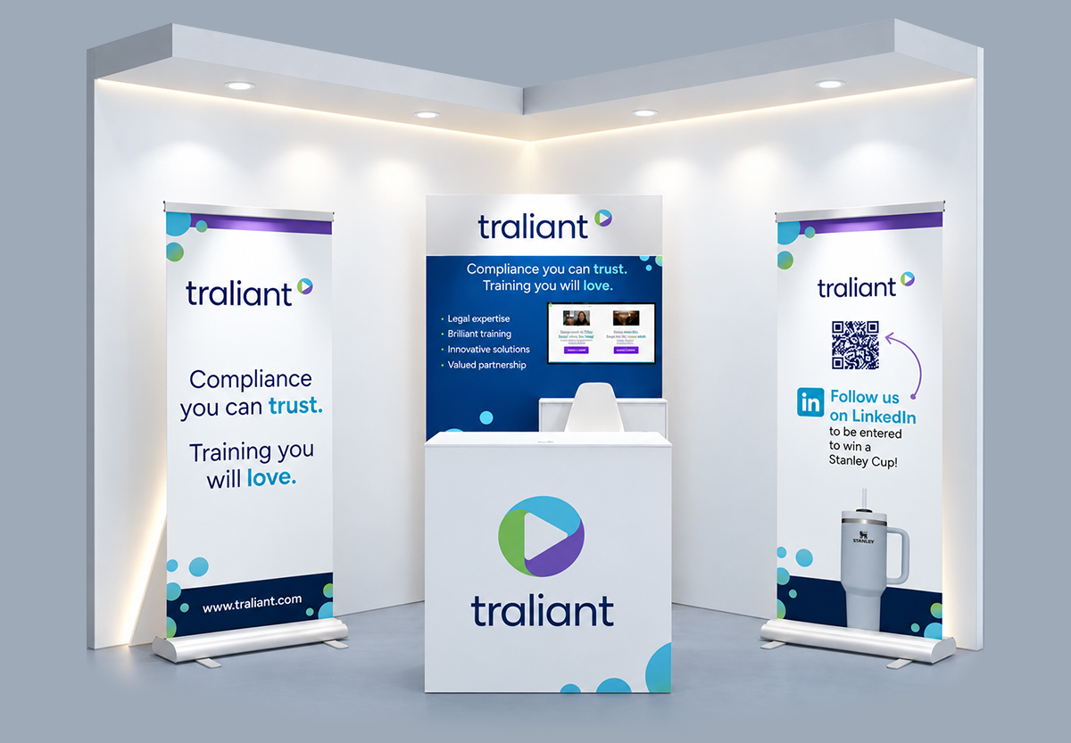
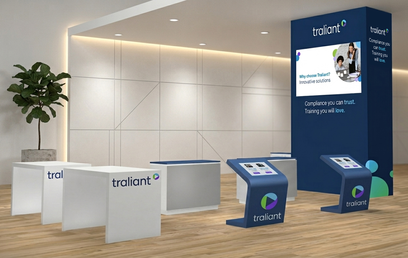
Environmental and Physical Branding
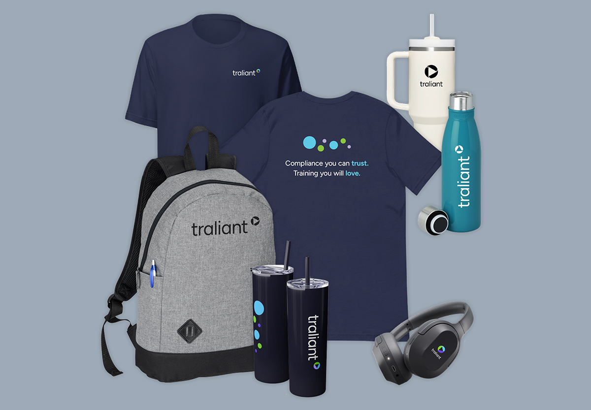
To ensure a consistent experience at in‑person events for customers and employees alike, I extended the visual system to include immersive tradeshow environments and custom brand collateral, creating a consistent look and feel that resonates long after the digital interaction ends.
Next project